

An interactive microsite featuring exhibitions and artists of the TextielMuseum, educating viewers of the textile history between two generations before their visit, through a pre-informed narrative experience.

This was an academic project for an information design course and the goal was to create an expressive microsite for a selection of clients. Our client was the TextielMuseum.
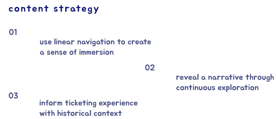
First, I came up with a content strategy and problem statement to base our work around:

How might we prime consumers with the historical context of the “Color and Abstraction” exhibition through a narrative experience in order to create an informed ticketing experience?

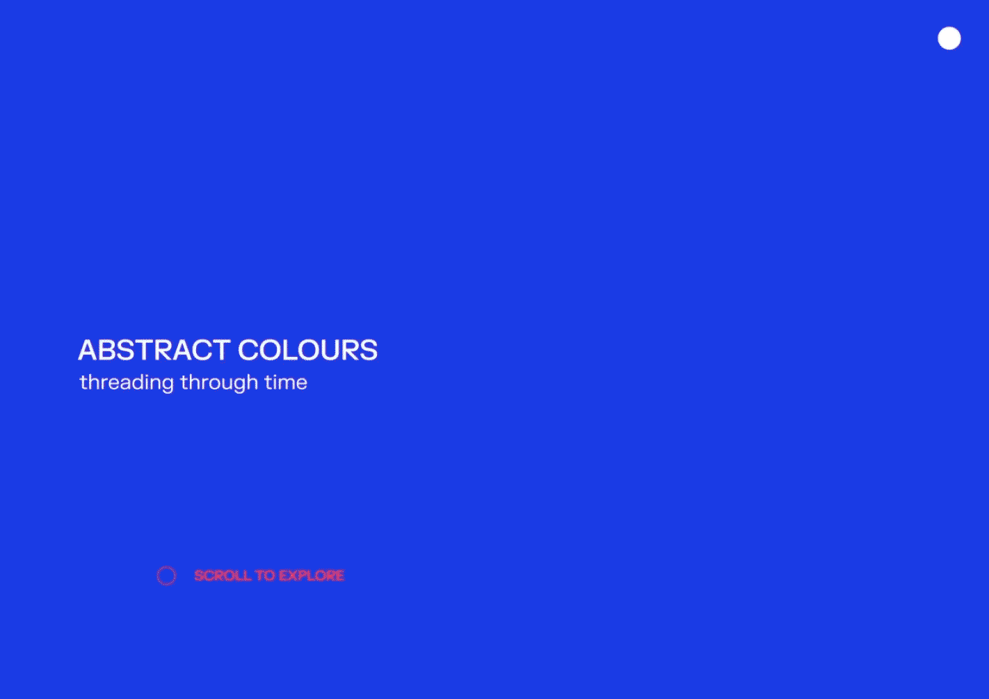
This is an overview of the finalized interactive microsite, starting with the user flow. The past iterations and how we came about the visual direction will be explained further down the page.

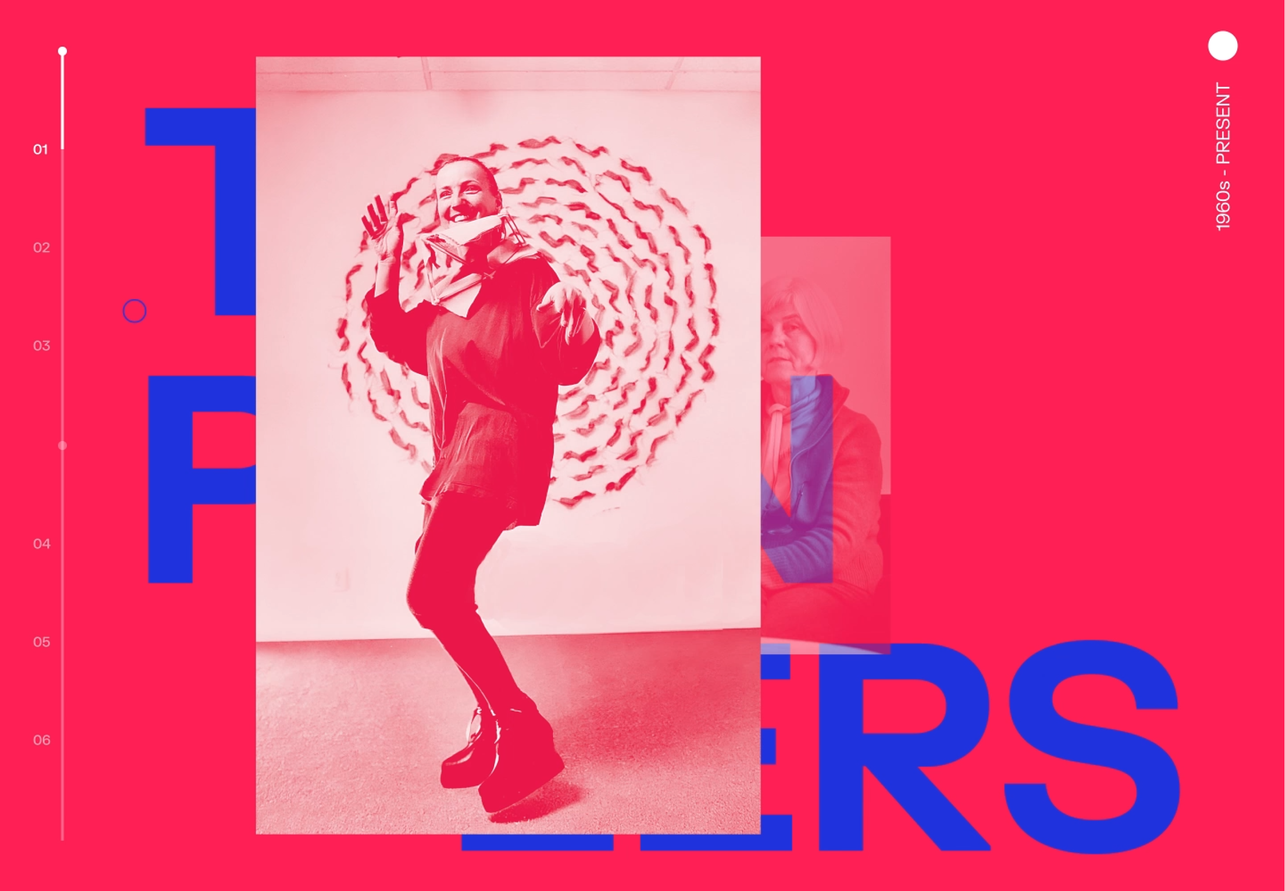
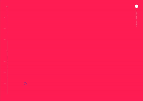
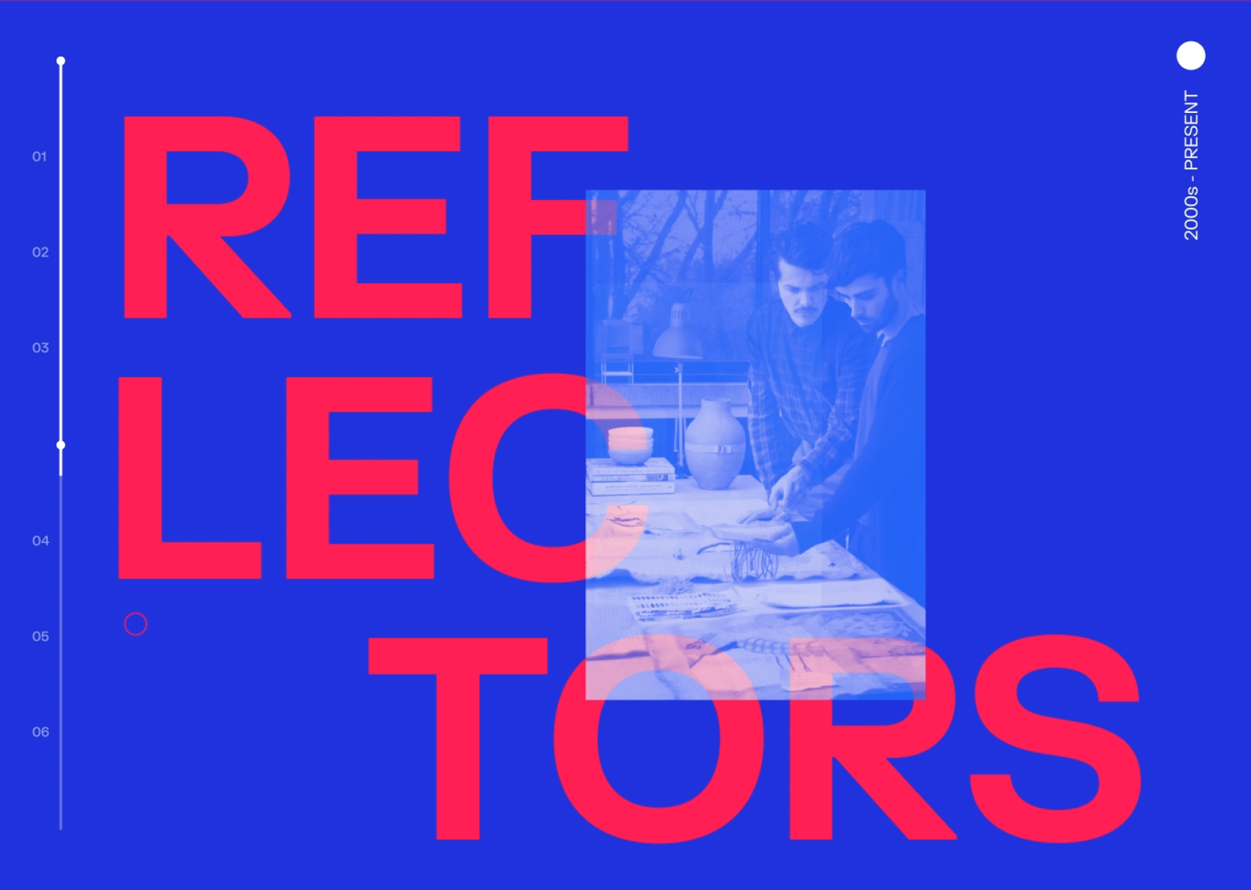
The tertiary coloured strips create high contrast, preparing visitors for the microsite’s vibrant theme. We wanted to set the tone for the impactful exploration of colours within the exhibition.


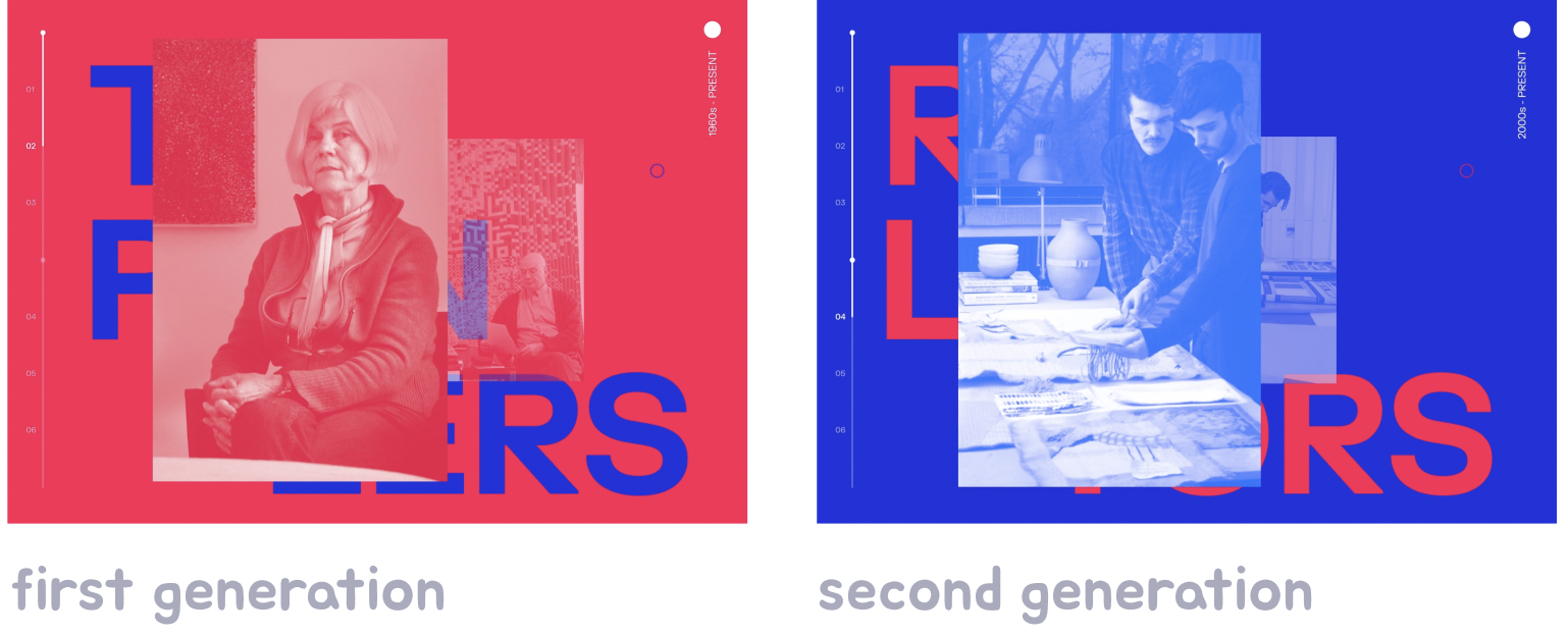
A text description prefaces each generation and describes a unifying theme of that group’s color exploration. This drives a narrative experience about the two generations and their ways of working.

The visitor is prompted to scroll and explore. Content is surfaced as the user scrolls, giving them a sense of control, pacing and immersion within the experience, and enhancing the site’s narrative intent.

Hovering over the progress bar reveals the two generation of artists currently being explored. Users may jump between sections by clicking the chapters, similar to skipping pages in a book.

Scrolling increases opacity and scale, creating a sense of depth and allowing the user to feel as if they are travelling through time across the two generations. A subtle swaying motion enhances the concept of floating through time and space.

Red is used as a theme for the first generation for its bold qualities which enhance the idea of the “pioneers”, and their explorations that crafted the fundamentals of textile work.
As users hover over an artist, a brief statement on their approach to colour is revealed through a reverse colour strip to encourage exploration. Continuing through the page forms a narrative connecting each generation under a common theme.

For ease of detection, hovering over clickable elements expands the circular cursor, allowing users to engage with the content.

Blue is used as the primary colour for the second generation for its introspective associations and enhances the semantics of their reflective work.

Clicking the circle reveals a secondary navigation of the whole microsite. As users hover over an artist’s name, previews of their work are revealed to pique interest. I wanted the colors of the navigation to remain consistent with the generation the user is currently exploring when clicking into it, in order to maintain cohesion.
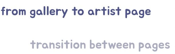
After selecting an artist of choice, users slide to the next page, similarly to flipping to the next chapter. This transition helps the user to feel as if they are continuing along a linear narrative.

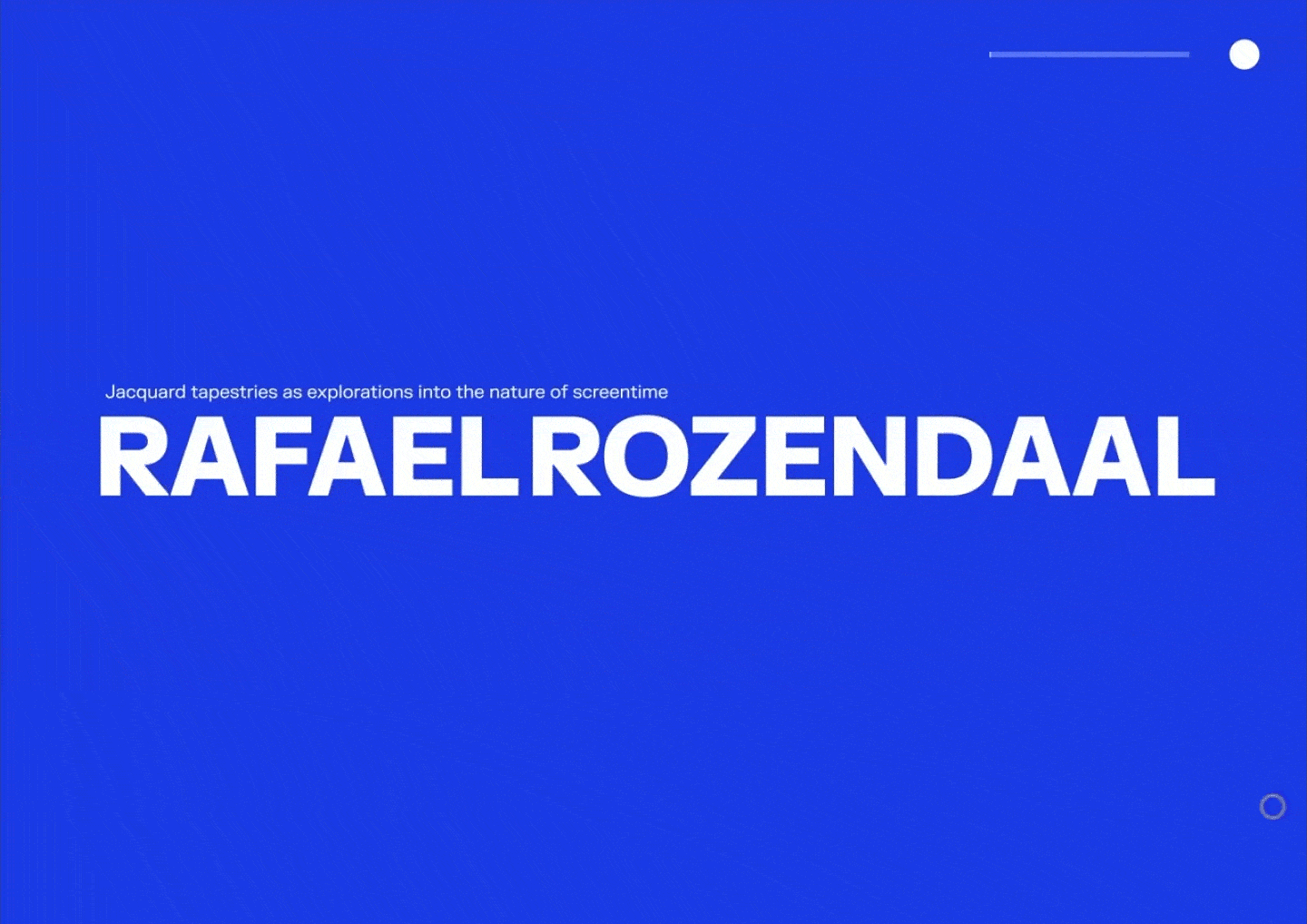
Users are greeted with an introduction of the artist within large scale type. This draws focus to the artist’s name, emphasizing their importance within the exhibition.

The experience of navigating through the artist page is similar to unfolding a story. Strips reveal information on an artist and symbolizes the unweaving of the textiles.


After scrolling to the end of the page, large scale type opens up to signify the end of the experience. An arrow then appears, prompting users to click and purchase a ticket to the exhibition.


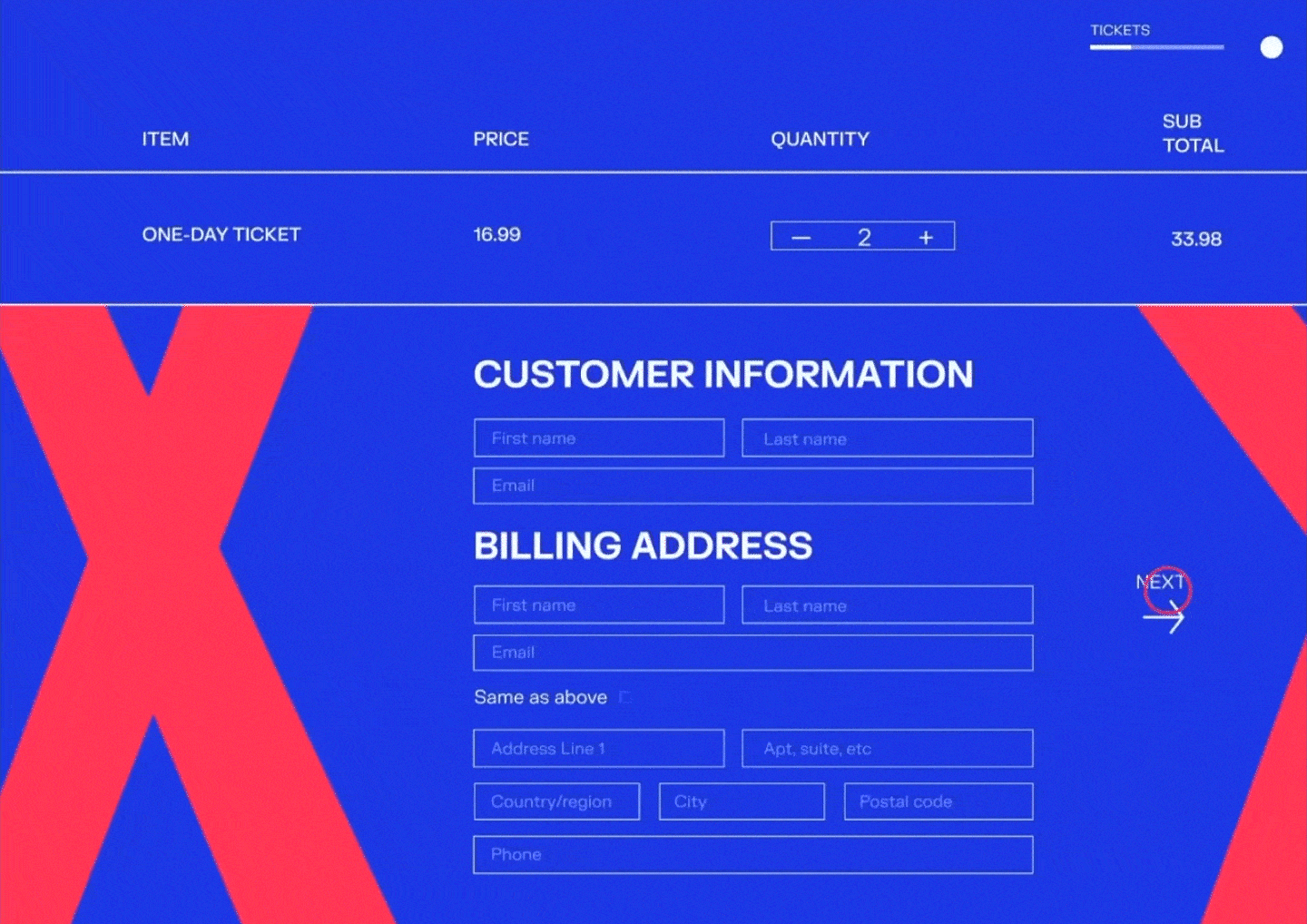
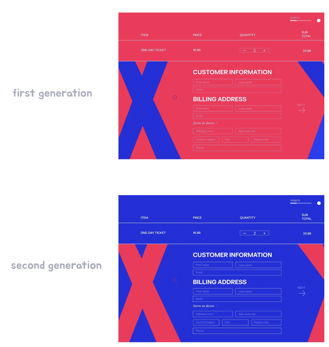
Depending on the generation the artist was from, I made screens to redirect users to a tickets page with that generation’s corresponding colour to maintain cohesion.
After filling in all necessary information and placing the order, they are offered the opportunity to re-explore artists to encourage continuous learning before their visit.

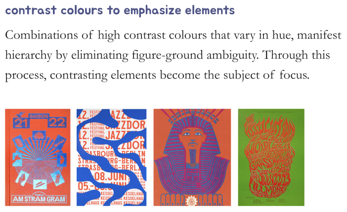
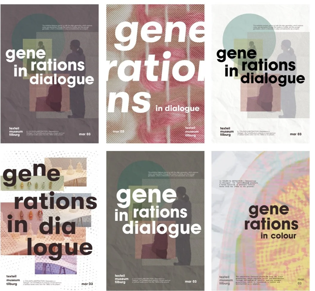
Our microsite was based off of a poster that we designed after incorporating Ellen Lupton’s design principles with design qualities from contemporary precedents such as NeoNeo and Main Studio. This way, we could mix and match different combos of principles and qualities while iterating.
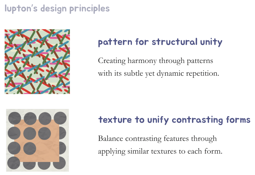
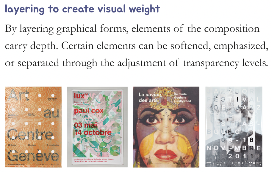
I mainly experimented with layering different textures to create depth and complexity. Most of my posters included trying out different transparency levels, and playing with the sizing of typography and economic use of space.
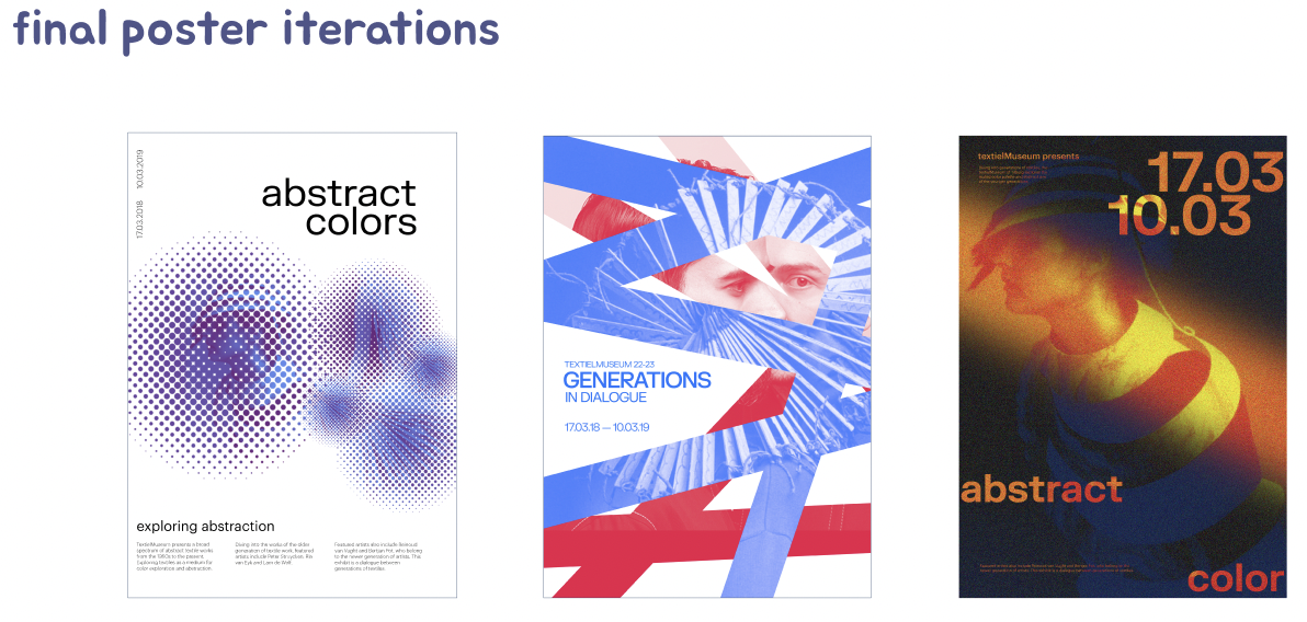
For our final direction (the poster in the middle!), we focused on colour treating contrasting images with a tertiary colour scheme. We worked with a sharp typeface that complements the diagonal cutouts of the images, creating continuity.

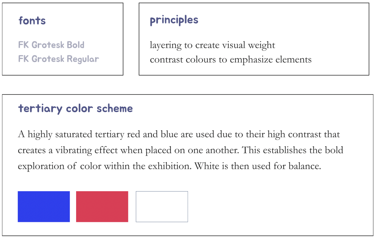
I proposed FK Grotesk Bold was used for its sharp corners to complement the loud tone of voice established throughout the microsite. Through the use of different weights, a distinct, yet subtle contrast is displayed.

This project has taught me how to find out the different innovative ways in which my team and I could keep the essence of principles & qualities of our designs while transitioning from print to web and enhancing user experience.
It was a bit difficult in the beginning, understanding the importance of switching mediums while also seamlessly preserving the original identity of the design. Working closely with my team reinforced the idea to me that effective communication is important when finding the balance between functionality and design.
Through copywriting, content strategy, and backing up the all reasonings behind our art direction, I learned how to create meaningful content through the choice of language used. Every word was selected intentionally to create an intimate connection between the user and the site.
Due to tight deadlines, I was unable to this time around but if I could go back and improve the microsite, I would like to try out more combinations of design principles and qualities and see what other posters could result from iterating. How different would the microsite have turned out?