AllTrails is an app catered towards those looking for outdoor adventures. By showing you the nearest hikes and trails depending on your location, there’s a fun activity waiting for you at all times. This project adds on a new feature to the current interface, ensuring safer exploration through the addition of hazardous identification markers.
This was an academic project for an interaction design course, improving the safety precautions for AllTrails.

Before deciding what feature to implement, I surfaced information about the app’s goals, its current interface, and what current users felt about it through in-app reviews. Fortunately, I was able to conduct interviews with a handful of friends who are avid hikers and frequently use the app.

final prototype

looking up reviews for certain hikes to get an idea about difficulty, snow, exposure, navigational tips, wildlife, etc.
likes to write reviews after completing a hike to help out other users and share his experience
primarily uses the distance and elevation gain viewer

instead of showing exact date of review publication, it will only show “x days/weeks/months ago”
user is frustrated because they want to know how busy a trail is and they don’t know if the reviewer hiked on a weekend or a weekday, and the season they hiked in

downloading maps
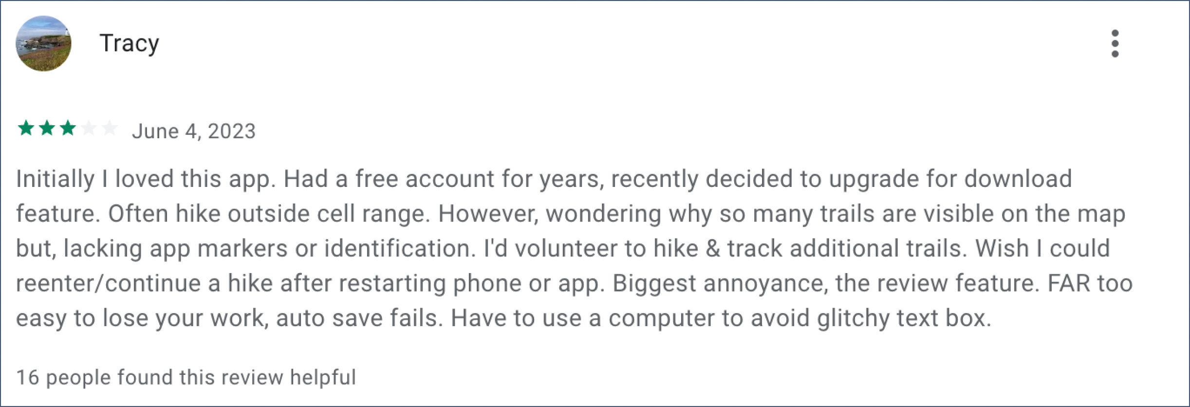
could be better and more detailed
not favourable when you’re in a location with no signal


Upon weighing in the pain points of avid AllTrails users and deciding what would benefit their hiking preferences best, I chose to move on with Feature 1: Identification Markers.
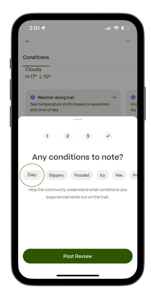
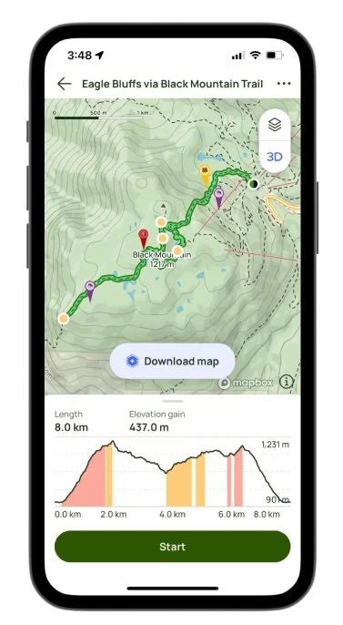
As users wouldn’t need to go through the hassle of more tapping when writing a review, the identification markers would automatically be set on the trail map interface, without the need for any additional interaction.
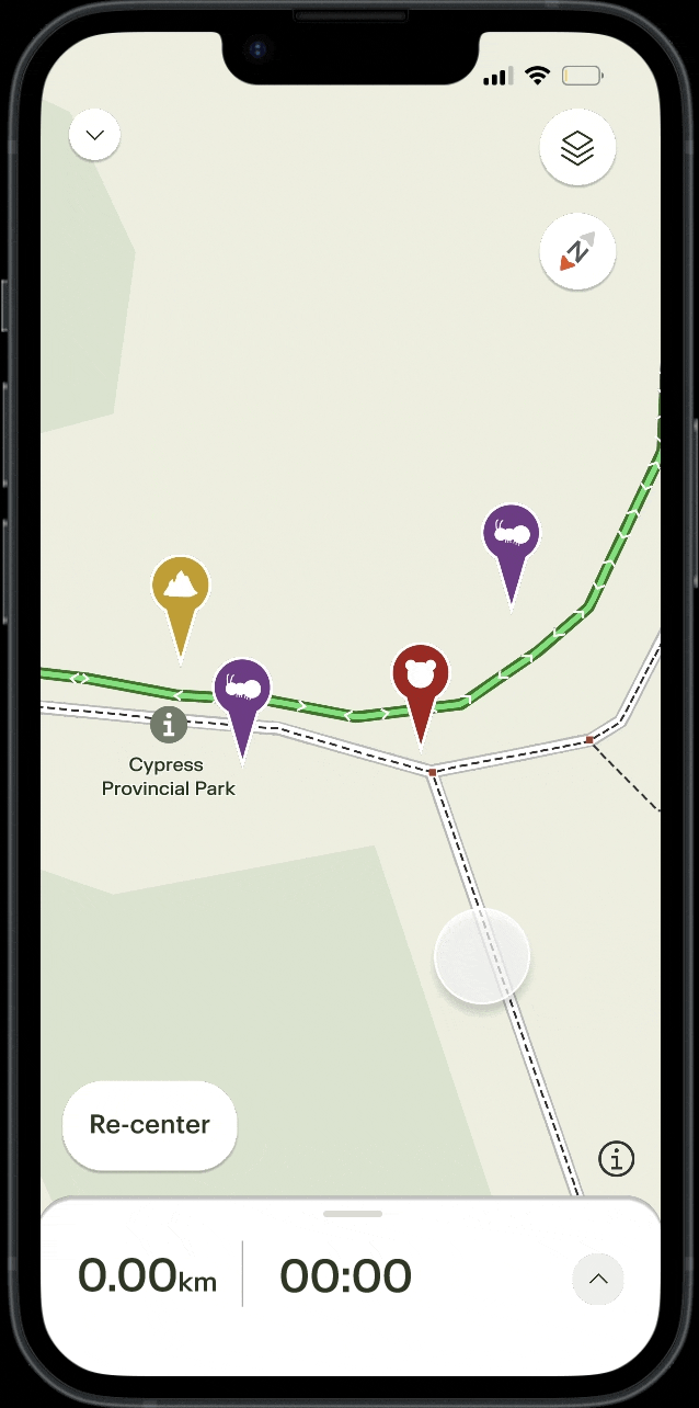
First, I wanted to work on any necessary aesthetic changes. By using Figma’s vector and pen tools, I created new identifiers that would feel more intuitive to users when signalling potential dangers in the area.
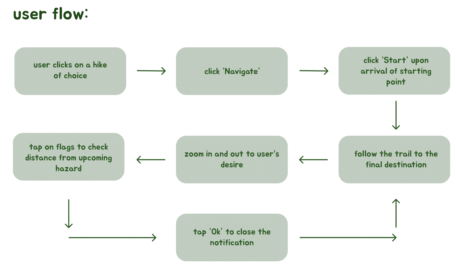
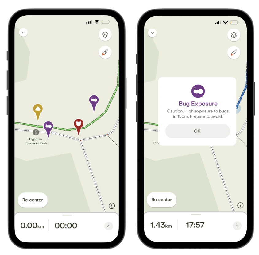
a pop up warning will appear when tapped, reminding users of how much further until they may encounter the hazard. Every time the user gets closer to the flag, the distance will update depending on their location

This was the first interaction design project that I have ever worked on and completed independently. As most of my projects have been collaborative and required a team effort, this felt brand new, exciting, and... a little stressful ideating alone!
I definitely learned that user interviews are extremely important in the design process. Getting to know your target audience and what they wish existed in reality can spark up a ton of ideas that you can just keep rolling off of.

Is there anything that I would’ve gone back and done differently?
Of course!
There’s always more to learn and improve as a designer and I feel like if I was given the opportunity to, I would experimented a bit more with what features I could implement.
I would have loved to create more storyboards to visualize what problems my proposed feature would help with, as well as diving deeper into similar competing apps for a better understanding of my client.
Determining what features would be feasible is also a good note to keep in mind. Although possibilities and ideas seem endless, I like to remind myself that they may not always work out!
the caution flags will be set alongside the trail, situated wherever any hazards may be
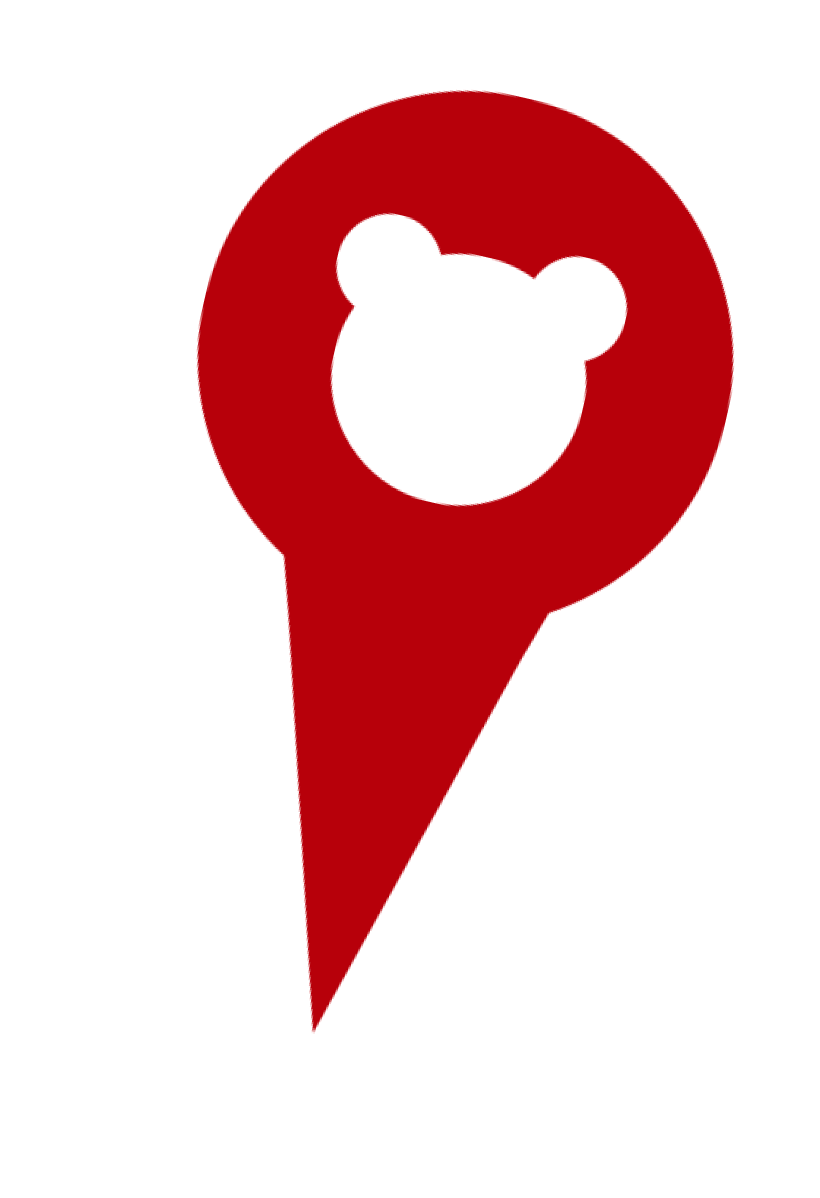
the flag would be: red for any rocky/steep conditions, yellow for wildlife warnings (with said animal icon), and purple for high exposure to bugs
the feature will be located on the fourth page as one of the bubbles after users tap on “Write Review”
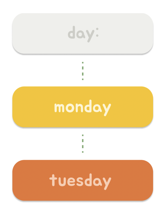
it will remain grey, labelled as “Day:” before users tap on it
after users tap on it once, it will jump to Monday. Two taps for Tuesday and so on

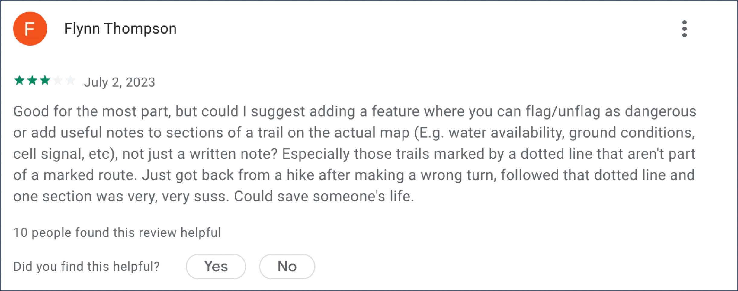
Other AllTrails users from the in-store app reviews, also complain about the confusing trails that are lacking identification markers.
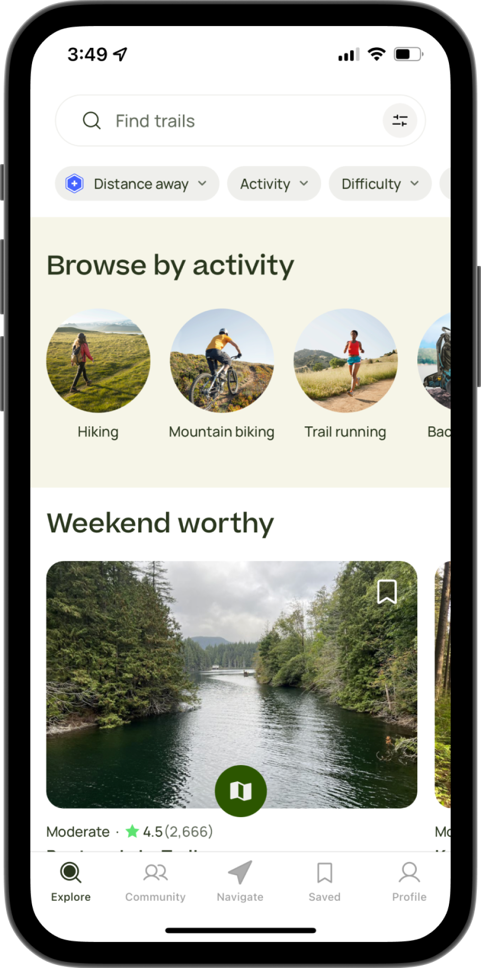
Upon noting down interface design patterns that I noticed within the app, I concluded that:
images take up a majority of the space
each featured activity has details on its length, difficulty, and review from those who have already completed them
the app mainly uses tags to distinguish whether the activity seems suitable to the user


users will be able to avoid dangerous areas of a trail
e.g. ground conditions, dead end, bears nearbyclear warnings can help users evaluate whether or not they should take an alternative route, or be geared up and ready
Before proposing a concrete solution, I circled through several new features, basing them off of the interviewees’ concerns. This brainstorming eventually resulted in two ideas: adding identification markers to the hiking trail interface or implementing a day selector.
this new feature will help users determine the busyness of a trail from past reviews
users will get a better idea of the difficulty of hikes based on past conditions